


One of the best ways to make your post stand out is by choosing a font that coincides with your pictures and designs. With over 150 fonts available, it can be hard to know what font to choose. Here are five tips to improve the quality of your posts, and to save you time when you’re selecting fonts!

1. Make it legible
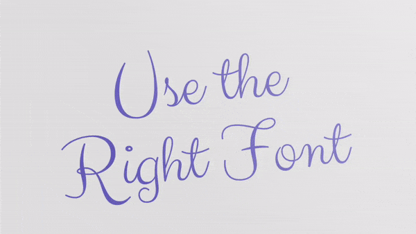
This may seem obvious, but remember that the purpose of your font is to convey your message. While it can be appealing to use the fanciest or the most unique font, if it’s not readily legible, your choice is doing more harm than good. When choosing a font, make sure you can easily read your text and keep the focus on your message.

2. Set the mood
Knowing the purpose of your post can help when choosing a font. If you are wishing an employee Happy Birthday, try a playful font. However, if you have a more serious topic, like listing the price of a home, using a simpler font that looks professional is more likely to bring in the traffic you want.

3. Know your audience
When creating a post it is important to know who you want to view it. For instance, if you are having a sale on hearing aids, it is a good idea to use a large easily read font. On the other hand, if you are selling skateboards, it is important to consider a fun and modern font that appeals to a younger audience.
4. Adjust depending on colors
While very bright colors, like Hot Pink, can make your post stand out, in some cases, very bright colors can be hard to read if they don’t provide enough contrast to the background. At the same time, a dark-colored font can make the post feel cold and unwelcoming. Whatever color you pick, make sure your text is clear, and that the color suits the mood and message you want to convey.

5. Blend with the design
When you are using an animation where the design moves across the screen from left to right, or where the font comes in on its own, a handwritten-looking font can be a great option. This allows the font style to compliment the design animation! On the other hand, when you choose a design that has the font within a square or rectangular pattern it is best to use larger, easier to read fonts.
Bonus tip – maintaining brand consistency
One way to keep your brand consistent is to use the same fonts in all of your posts. To keep your fonts the same, go to your Business Profile Settings and scroll down to “Fonts”. Choose the default brand fonts you want for your business. You can add a default primary font that will be used by all designs. The secondary font is automatically applied in designs that offer two fonts. Watch the video to see how to update your default brand fonts.


